import numpy as np
from matplotlib import pyplot as plt
import pandas as pd
import seaborn as sns

df_stimuli = pd.read_parquet("https://uni-bonn.sciebo.de/s/G64EkHoQkeZeoLm/download")
df_spikes = pd.read_parquet("https://uni-bonn.sciebo.de/s/mLMkb2TwbNx3Yg6/download")Modern electrophysiology equipment like the Neuropixels probes allows for simultaneous recording of hundreds of neurons. This leaves researchers with massive amounts of data to process and visualize. Fortunately, the Python ecosystem provides powerful tools for generating beautiful visualizations from large amounts of data in only a few lines of code. In this post, I’ll use data from a 2021 study by Joshua Siegle and colleagues1, conducted at the Allen Institute, where they recorded tens of thousands of neurons from six different cortical regions across multiple experimental conditions.
In this post, I’ll take the recordings from a single animal that was presented with bright flashes. I’ll visualize the responses across cortical regions in peri-stimulus time histograms (PSTHs) using Pandas and Seaborn. Why Pandas and Seaborn? While these libraries are not geared towards electrophysiological data, they offer established powerful tools for analyzing large amounts of data. A good understanding of Pandas and Seaborn will also be useful in a variety of scenarios since these libraries are widely used in academia and industry.
To follow along with my examples, install the required packages and download the data as described in the next section.
Prerequisites
First we have to install the required modules using pip:
pip install numpy matplotlib seaborn pandas pyarrowThen, we can import the installed modules and download the data. We need two data frames — one containing the timing of the presented stimuli and another one containing the recorded spikes. Conveniently, all read_ functions in Pandas accept URLs and can gracefully handle the downloading for us.
Referencing Spike Times to Stimulus Presentations
First, let’s take a look at the data. We have two data frames: df_stimuli contains the start and stop time for every stimulus 2 and df_spikes contains the unit ID, brain area and time for every recorded spike.
df_stimuli.head(5)| start_time | stop_time | |
|---|---|---|
| 0 | 1276.297013 | 1276.547221 |
| 1 | 1280.300363 | 1280.550569 |
| 2 | 1286.305383 | 1286.555591 |
| 3 | 1290.308743 | 1290.558946 |
| 4 | 1294.312073 | 1294.562279 |
df_spikes.head(5)| unit_id | brain_area | spike_time | |
|---|---|---|---|
| 0 | 951031334 | LM | 1276.297339 |
| 1 | 951031154 | LM | 1276.298206 |
| 2 | 951031243 | LM | 1276.298739 |
| 3 | 951021543 | PM | 1276.299007 |
| 4 | 951031253 | LM | 1276.301272 |
To be able to relate the spiking to the presented stimuli, we have to combine the information from Table 1 and Table 2. To do this, we first create a new column in the stimulus dataframe called "analysis_window_start"3 which is simply the stimulus onset minus 0.5 seconds. Then, we use pd.merge_asof() to match every spike with the closest analysis window. In the merged data frame df, we subtract the stimulus start time from the spike time which gives us the spike time relative to the stimulus. Finally, we remove all relative spike time values greater than 1 and remove the columns we don’t need. The final dataframe contains all spikes happening between 0.5 seconds before and 1.0 seconds after stimulus onset.
df_stimuli["analysis_window_start"] = df_stimuli.start_time - 0.5
df = pd.merge_asof(
    df_spikes, df_stimuli, left_on="spike_time", right_on="analysis_window_start"
)
df.spike_time -= df.start_time
df = df[df.spike_time <= 1.0]
df = df[["spike_time", "brain_area", "unit_id"]]
df.sample(5)| spike_time | brain_area | unit_id | |
|---|---|---|---|
| 270426 | 0.693947 | RL | 951039413 |
| 347013 | -0.472633 | LM | 951030804 |
| 109297 | 0.920462 | AL | 951035499 |
| 201771 | -0.488358 | LM | 951031458 |
| 135671 | 0.369972 | AL | 951035530 |
Creating a Peri-Stimulus Time Histogram
Now we can quantify how the spiking changes in response to the stimulus. To do this, we create an array of 10 millisecond wide bins between -0.5 and 1.0 seconds, group the data by unit ID and brain area and count the spike time values that fall into each bin. Finally, we reset the index of the returned series, take the middle of each bin and rename the columns. The resulting dataframe contains the spike count for every unit in every bin.
bins = np.arange(-0.5, 1, 0.01)
psth = (
    df.groupby(["unit_id", "brain_area"])
    .spike_time.value_counts(bins=bins)
    .reset_index()
)
psth.spike_time = psth.spike_time.array.mid
psth.columns = ["unit_id", "brain_area", "bin_time", "spike_count"]
psth.sample(5)| unit_id | brain_area | bin_time | spike_count | |
|---|---|---|---|---|
| 5087 | 951016626 | AM | -0.095 | 4 |
| 48136 | 951035393 | AL | -0.425 | 3 |
| 51176 | 951035619 | AL | -0.425 | 3 |
| 3032 | 951016257 | AM | -0.485 | 0 |
| 49921 | 951035523 | AL | 0.655 | 11 |
To visualize the PSTH, we’ll use seaborn’s relplot() function to plot the spike counts against the bin times. We can also add reference lines at 0 and 0.25 seconds that mark the stimulus onset and offset. There is a clear pattern — spiking increases after the onset, falls back to baseline, increases again after the offset, drops below the baseline and then rebounds.
g = sns.relplot(data=psth, x="bin_time", y="spike_count", kind="line")
g.refline(x=0, color="black", linestyle="--", alpha=0.5)
g.refline(x=0.25, color="black", linestyle="--", alpha=0.5)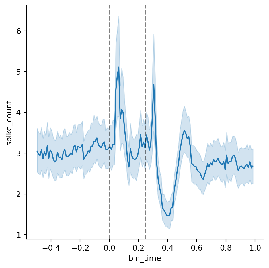
We can also add a hue to encode the brain area and zoom in on the x-axis in order to make out differences in the spiking profile between brain areas (we’ll set errorbar=None because the overlapping confidence intervals will make the plot hard to read).
g = sns.relplot(data=psth, x="bin_time", y="spike_count", kind="line" , hue="brain_area", errorbar=None)
g.set(xlim=(-0.1, 0.5))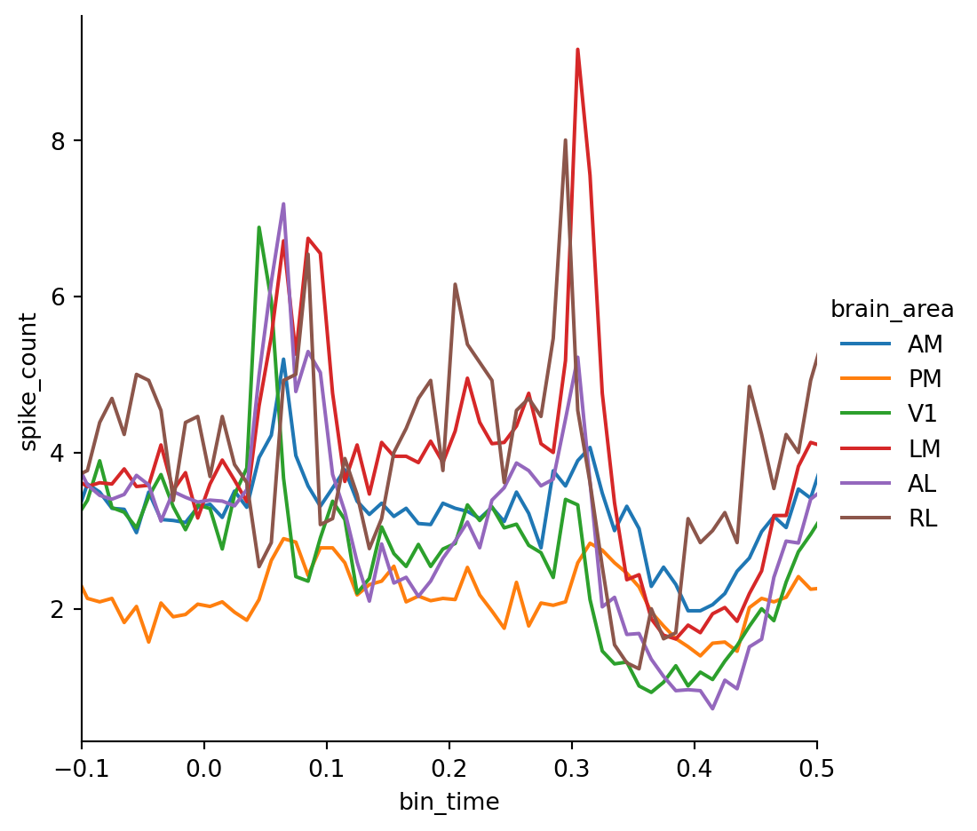
We can see that spiking in the primary visual cortex V1 peaks first which is expected since it represents the lowest level in the visual processing hierarchy. However, there are large differences in the average firing rate between areas which makes this plot hard to read. To overcome this limitation we have to apply baseline correction.
Applying a Baseline Correction
To compute the baselines, we select all spikes that happen before 0 seconds (i.e. the stimulus onset), group the data by unit ID and calculate the mean spike count to obtain an estimate of each unit’s average firing rate in absence of the stimulus. Then, we merge the baseline estimates with the PSTH and create a new column called "spike_count_change" by subtracting the baseline from the spike count.
baseline = psth[psth.bin_time < 0].groupby(["unit_id"]).spike_count.mean()
baseline.name = "baseline"
psth = psth.merge(baseline, on="unit_id")
psth["spike_count_change"] = psth.spike_count - psth.baseline
psth.sample(5)| unit_id | brain_area | bin_time | spike_count | baseline | spike_count_change | |
|---|---|---|---|---|---|---|
| 43092 | 951032519 | LM | 0.255 | 1 | 0.66 | 0.34 |
| 9386 | 951017481 | AM | 0.985 | 0 | 0.14 | -0.14 |
| 22466 | 951026176 | V1 | 0.785 | 1 | 1.62 | -0.62 |
| 38479 | 951031253 | LM | 0.025 | 12 | 8.76 | 3.24 |
| 23925 | 951026481 | V1 | 0.135 | 0 | 0.92 | -0.92 |
Now we can recreate our area-specific PSTH plot using the spike count change — the result looks much clearer!
g = sns.relplot(
    data=psth,
    x="bin_time",
    y="spike_count_change",
    kind="line",
    hue="brain_area",
    errorbar=None,
)
g.set(xlim=(-0.1, 0.5))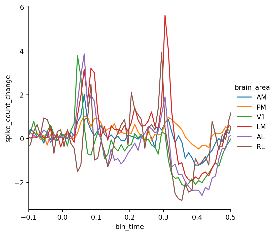
However, there is still a problem: the number of units that respond to the stimulus varies across brain areas as higher visual areas generally respond less to simple flashes which confounds our analysis. In order to interpret the absolute spike counts we need to identify the units that actually respond to the stimuli.
Identifying Responsive Units
To identify the responsive units, we first compute the relative change in spiking by dividing the baseline subtracted spikecount by the baseline. We add a small regularization coefficient \(\epsilon\) to avoid that baseline values close to 0 inflate the estimate 4. Then, we can plot the relative change in spiking for every unit (this requires setting estimator=None). Let’s add a horizontal line to mark the threshold for responsiveness — in this example, we want to consider a unit responsive if its relative spike count increases 5 times with respect to the baseline. This method of identifying responsive units is not statistically rigorous, but it is a quick and convenient way of filtering the data for visualization.
epsilon = 0.5
threshold = 5
psth["rel_spike_count_change"] = (psth.spike_count - psth.baseline) / (
    psth.baseline + epsilon
)
g = sns.relplot(
    psth,
    x="bin_time",
    y="rel_spike_count_change",
    units="unit_id",
    kind="line",
    estimator=None,
)
g.refline(y=threshold, color="black", linestyle="--", alpha=0.5)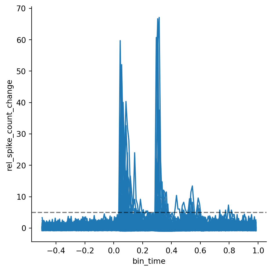
Now, we group the data by unit ID and check whether each unit’s maximum value for the relative change in spike count is above the selected threshold. Then, we merge the result with the PSTH to get a new column with boolean values that indicate whether any given unit is responsive. Finally, we can reproduce Figure 3 selecting only the units that are responsive according to our threshold criterion.
is_responsive = psth.groupby(["unit_id"]).rel_spike_count_change.max() > threshold
is_responsive.name = "is_responsive"
psth = psth.merge(is_responsive, on="unit_id")
g = sns.relplot(
    data=psth[psth.is_responsive],
    x="bin_time",
    y="spike_count_change",
    kind="line",
    hue="brain_area",
    errorbar=None,
)
g.set(xlim=(-0.1, 0.5))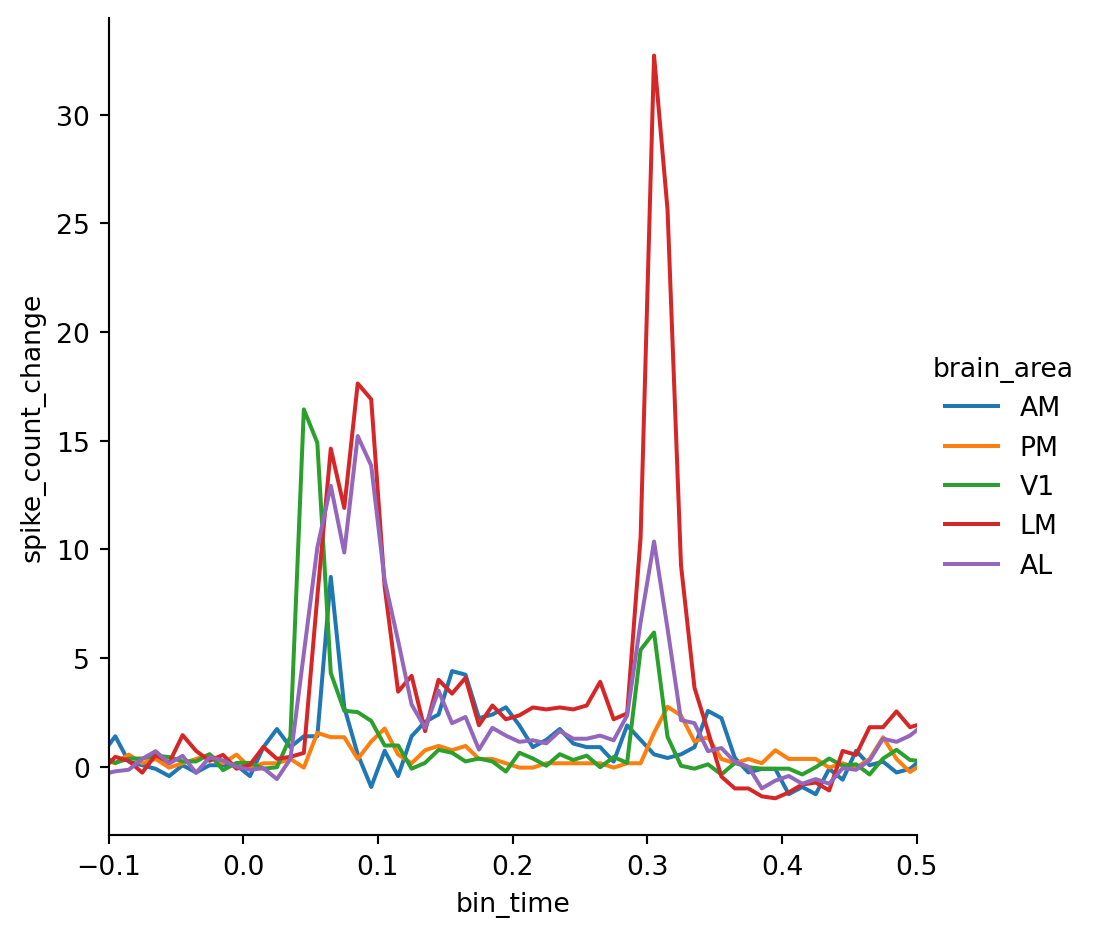
Now the differences in response latency between the areas are much clearer. We can also make out some interesting trends — for example, units in V1 appear to respond mostly to the stimulus onset while units in LM respond more strongly to the offset.
Closing Remarks
The goal of this post was to show how you can use Pandas and Seaborn to create detailed and informative graphs from large datasets (i.e. tables with hundreds of thousands of rows) with relatively little code. The methods for data aggregation, merging and visualization shown here will be applicable to any data that can be arranged in a tabular format. What this demo lacks is a statistical comparison of the spiking activity between brain areas. This was outside of the scope of this post since I only used data from a single animal. If you are interested in working with the full dataset you can check out my GitHub repo which contains the recordings from over 50 animals in the same data format used in this demo.
Footnotes
Siegle, J. H., Jia, X., Durand, S., Gale, S., Bennett, C., Graddis, N., … & Koch, C. (2021). Survey of spiking in the mouse visual system reveals functional hierarchy. Nature, 592(7852), 86-92.↩︎
All stimuli are full-field flashes so there isn’t any relevant information besides the stimuli’s timing↩︎
We could skip creating the
"analysis_window_start"column and merge the data using the stimulus onsets. However, then we would lose the spikes that occur right before the onset which we need to compute the baseline.↩︎The exact value of \(\epsilon\) is not that relevant here, so feel free to try out different values. However, be aware that larger values of \(\epsilon\) will lead to smaller values of the relative change in spike count for all units, so you’ll have to adapt the threshold as well.↩︎